Changing your instagram story background color to a branded solid color is a simple way to increase Story completion rates by 25% and drive more calls, messages, and bookings. The fastest way to do it is to open Stories, add any image, tap the three dots, choose Draw, pick your color, then press and hold the screen to fill the background.
If you're managing a dental office in [City], an HVAC brand across multiple territories, or a med spa with several locations, you've probably had this moment. You need to post a quick update, review screenshot, promo, or last-minute opening, but Instagram's default gradient makes it look off-brand and harder to read.
That small visual choice affects results. Stories already reach over 500 million daily active users globally according to Evergreen Feed's Instagram Story color background analysis, and for local businesses, cleaner visuals usually mean better attention on the action you care about: tap to call, send a DM, book now, or get directions.
Table of Contents
- Why Your Story Background Matters for Conversions
- Four Quick Ways to Customize Your Background Color
- Advanced Branding with Custom Colors and Overlays
- Actionable Templates for Your Local Business
- Connecting Your Stories to Local SEO and Measurement
- Instagram Story Backgrounds FAQ
- Can I set a default background color for all my Stories
- What’s the best background color for a service business
- Why does my background look different on different phones
- Should I use a solid fill or a video tint
- Can I use Story backgrounds to support “near me” searches
- What apps are best for custom Story backgrounds
- Where can I improve my posting timing
Why Your Story Background Matters for Conversions
A practice manager posts a five-star review to Stories at 7:15 a.m. before the phones get busy. By 7:16, it is gone in the feed of everyone who saw three other Stories first. The review itself may be strong, but if the background is hard to read, off-brand, or visually noisy, people skip before they register the message or tap to book.
Story background color affects three things that show up in real results. Readability. Recognition. Response. A clean, high-contrast background helps a viewer catch the headline fast, understand the offer, and decide whether to message, call, or tap through.
Practical rule: If someone cannot read the headline and spot the CTA in one glance, the Story is costing you attention you already paid for with your time.
One published roundup notes that Instagram Stories reach a very large daily audience and that custom backgrounds can improve retention and visibility compared with default-looking posts, as summarized earlier by Evergreen Feed. The exact percentages matter less than the operating takeaway for local businesses. Better contrast and stronger branding usually hold attention longer.
That matters even more for multi-location brands. If each office, clinic, or storefront posts Stories with random colors, your locations train customers to ignore your content. If every location uses the same few approved background styles for reviews, limited-time openings, FAQs, and community updates, you build recognition across your online marketing and make reputation content easier to spot. Good Story design also supports the same brand signals you want to reinforce through your website, Google Business Profile, and broader digital marketing for local businesses.
I usually recommend choosing backgrounds by business goal, not personal taste. A dental office promoting same-week hygiene slots may need a bright, clean background that makes availability obvious. A law firm sharing a client testimonial often performs better with a darker, calmer background that feels credible and keeps the quote readable. A home services company can use one consistent color family for service reminders across all territories so people recognize the brand before they read the caption.
The business outcome is simple. More people finish the Story, more people understand the next step, and more of the right viewers turn into calls or bookings.
If you want to improve views as well as design, ClipCreator.ai's Story tips are a useful companion resource.
Four Quick Ways to Customize Your Background Color
These are the fastest native methods inside Instagram. You don't need a designer, and you don't need extra software just to make a Story look intentional.
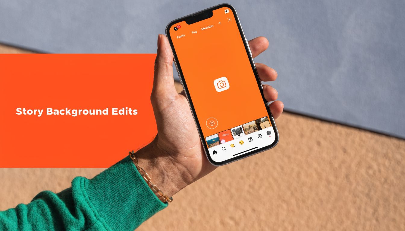
Use Create Mode for a clean solid background
This is the simplest option for text-heavy announcements.
- Open Instagram Stories.
- Upload any photo, or take a quick one.
- Tap the three dots, then tap Draw.
- Pick a color from the preset row.
- Press and hold the screen.
- Tap Done.
- Add your text, stickers, review screenshot, or booking CTA.
This works well for a dental office in [City] announcing same-week hygiene openings or a senior living community promoting upcoming tours. A solid background keeps the eye on the offer.
What works:
- Short headline first: “2 hygiene spots open this week”
- One action only: “Message us to claim”
- High contrast: Dark text on a light background or light text on a dark background
What doesn't:
- Long paragraphs
- Three different sticker types fighting for attention
- Low-contrast brand shades that look elegant on a website but unreadable on a phone
Use Instagram’s gradient and preset backgrounds
Instagram gives you a few built-in options like black, gray, and certain gradients. They're fast, and that's their main advantage.
Use them when speed matters more than exact brand matching. For example, a restaurant manager in [Neighborhood] posting tonight's special doesn't need Canva every time. A dark preset with one photo sticker and a location tag can be enough.
A simple decision guide helps:
| Need | Best option |
|---|---|
| Fast text update | Solid fill |
| Casual promo | Preset gradient |
| Full brand consistency | Custom image background |
| Busy photo that needs readability | Tint overlay |
If you're building backgrounds outside Instagram, Taap.bio's Instagram Story specs are handy for getting the right size and layout before you upload.
Use the text background trick for quick announcements
Sometimes you don't need to fill the whole screen. You just need one colored box behind the message.
Type your text, tap the text style controls, and use Instagram's text background option. That gives you a compact color block behind the words while leaving the rest of the Story lighter or more visual.
This is useful when:
- Sharing a review screenshot: Add a colored text bar that says “Thanks, [City]”
- Posting a limited opening: Add “Today only” over a simple photo
- Running a local offer: Add “Free estimate in [Neighborhood]”
Keep announcements to one idea per Story frame. If you need to explain more, use a sequence of two or three frames instead of shrinking the font.
Use the eyedropper to match a photo or logo
The eyedropper is the best built-in feature for making fast Stories look branded.
Upload a logo, product image, or even a staff photo. Open Draw, tap the eyedropper, and sample a color already in the image. Then use that color for the background, text block, or accents.
This works especially well for:
- Med spas pulling a calm color from a treatment room image
- HVAC companies matching a trusted brand blue from a truck wrap
- Auto shops sampling a dark metallic tone from a vehicle photo
- Vets pulling a softer shade from a pet image so the Story feels warm, not harsh
If a Story feels mismatched, the problem usually isn't the content. It's that the colors don't belong together.
Advanced Branding with Custom Colors and Overlays
A busy practice manager usually does not lose bookings because a Story used the wrong shade of blue once. Problems show up when five locations post five different looks, patients cannot tell which office is speaking, and review screenshots, promos, and staff updates all feel disconnected. That inconsistency weakens recall, lowers response rates, and makes it harder to tie Story activity back to calls or appointments.
Match your exact brand color
If your business uses a specific navy, teal, orange, or charcoal, store the hex code in your brand guide and build Story-ready backgrounds outside Instagram. Canva and Adobe Express are fine for this. Create a small library of 1080×1920 backgrounds and organize them by use case: reviews, promos, hiring, events, and location updates.
For multi-location teams, fewer options usually perform better than endless flexibility. Give each location three approved background styles, one light, one dark, and one promotional color. Keep the hex codes, fonts, logo spacing, and CTA placement in one shared file. Then make one rule clear. If a manager is posting a review Story, they use the review template. If they are posting a limited-time offer, they use the promo template.
That setup saves time, but the bigger win is operational. Patients start recognizing your Stories faster, staff spend less time making design choices, and your reporting gets cleaner because each template maps to a specific campaign type. If you are documenting those decisions across channels, this sample branding strategy for local businesses is a useful reference point.
Use tinted video overlays without hiding the content
A full solid fill on top of video usually reduces the value of the video itself. People need to see the treatment room, the technician, the smiling patient, or the finished repair. A light tint keeps the footage visible and gives you enough contrast for readable text.
According to Tailwind's write-up on changing Instagram Story background color, lighter tint overlays outperformed solid fills for branded Story presentation. That matches what I see in local campaigns. Reviews and testimonial clips work better when the person, place, or result is still visible.
Use this process:
- Upload a video into Stories.
- Tap the three dots, then Draw.
- Switch to the highlighter tool.
- Use the eyedropper to select a color from the video or your brand palette.
- Press and hold once for a light tint.
- Repeat if the text still lacks contrast.
Keep the trade-off in mind. A darker overlay improves readability, but too much tint strips out the human proof that makes the Story believable.
For a med spa, that might mean keeping the treatment room visible under a soft beige overlay. For a vet clinic, it means the pet and owner still read clearly on screen. For an auto shop, the repair result should remain obvious before the CTA appears. If you prepare clips outside Instagram first, this guide to mastering Instagram video sizes helps prevent awkward cropping before you add overlays.
Actionable Templates for Your Local Business
A busy practice manager does not need more Story ideas. You need repeatable Story formats that look on-brand, match the background techniques from this guide, and turn taps into DMs, calls, and bookings across every location.
The easiest way to do that is to assign a background color system to a few Story types, then reuse them. A review Story should look different from an urgent opening Story. A team Story should feel warmer than a promo Story. That visual consistency helps followers recognize the message faster, and it gives multi-location teams a cleaner standard to follow.
If you need more campaign ideas around these formats, this roundup of content marketing examples for local businesses is a useful planning reference.
Template 1. Review of the Week Story
Best for: dental groups, med spas, vet clinics, senior living, home services
Goal: build trust, drive profile visits, prompt DMs
Background setup
- Use a brand color fill or soft tint behind a review screenshot
- Pick a light neutral if the review is long
- Use a darker brand color if the review is short and you want the CTA to stand out
- For multi-location brands, give each location the same layout but swap in that office's city or neighborhood name
Story copy template
Headline: Review of the Week in [City]
Body: “They made the whole visit easy and explained everything clearly.”
Attribution: Google review from [First Name/Initial]
CTA: Reply "INFO" and we'll send details or availability for [service]
Why the background choice matters
The background needs to frame the review, not compete with it. A beige, white, or muted brand tone usually works better than a loud fill because the review itself is the proof. If the office wants to strengthen reputation signals by location, add the city name directly on the Story so the content reinforces local relevance.
DM reply template
Hi [First Name], thanks for replying to our Story. Are you looking for [service] at our [City] location? We can send hours, pricing info, or the fastest way to book.
Template 2. Last-Minute Opening Story
Best for: salons, med spas, dental offices, repair shops, clinics with cancellations
Goal: fill open slots fast
Background setup
- Use a high-contrast background color tied to urgency
- Keep it within your brand palette. Deep red, orange, or bold navy can work if text stays easy to read
- If you add a photo or video, use a light tint so the opening still feels real, not overdesigned
Story copy template
Headline: Opening Today in [Location]
Body: 2 spots just opened for [service] at [time range]
CTA: DM "BOOK" or tap Call
Why the background choice matters
Urgent Stories need to stop the scroll in one second. A stronger color helps. The trade-off is that aggressive colors can feel off-brand for healthcare, family services, or senior living. In those cases, use a darker version of your core brand color instead of a bright promo shade.
DM reply template
Hi [First Name], we still have availability at our [Location] office. What time works best for you today? If you prefer, call [Phone Number] and our front desk can book it now.
Template 3. Meet the Team Story
Best for: any business where trust affects conversion
Goal: reduce hesitation before first contact
Background setup
- Use a soft overlay pulled from your brand colors
- Keep the staff photo visible
- Avoid heavy fills that hide faces, uniforms, treatment rooms, or shop details
Story copy template
Headline: Meet [Name] at our [City] location
Body: [Name] helps patients with [service] and is known for [helpful trait]
CTA: Send us a question about [service]
Why the background choice matters
People book people. This format works best when the background supports the photo instead of covering it. For service businesses with multiple offices, this is also a simple way to show each location is staffed, active, and local.
DM reply template
Thanks for your message. [Name] works from our [City] location. What would you like to know about [service] or availability?
Template 4. Before-and-After or Result Story
Best for: med spas, auto shops, contractors, cleaners, groomers
Goal: show proof without losing readability
Background setup
- Start with the image or short clip
- Add a light tint overlay, not a solid fill
- Pull the tint color from the photo so the Story feels consistent
Story copy template
Headline: Real result from [City]
Body: [Short result statement]
CTA: Reply "QUOTE" for pricing or next steps
Why the background choice matters
The result has to stay visible. If the tint is too dark, you lose the proof. If the text blends into the image, you lose the conversion. This is one of the easiest places for local teams to get inconsistent, so give every location one approved overlay strength and one approved text style.
Template 5. Review Follow-Up Story for Reputation Recovery
Best for: businesses working through mixed feedback
Goal: show responsiveness without turning Stories into a complaint thread
Background setup
- Use a calm, trust-building color such as navy, green, gray, or another stable brand tone
- Keep the layout clean. No loud stickers unless they fit your brand
- If you mention service improvements, use simple text on a solid background
Story copy template
Headline: What we're improving at our [Location] office
Body: You told us wait times mattered. We've updated scheduling and added more check-in support.
CTA: Reply with feedback or questions
Why the background choice matters
Story backgrounds tie directly into reputation management. A steady, restrained color signals professionalism. It also gives your team a way to address concerns in public without sounding defensive. For multi-location brands, this template works best when each office can localize the issue and response instead of posting one generic corporate message.
7-day rollout for multi-location teams
Day 1: Choose 3 Story types each location will use this month. Reviews, openings, and team introductions are usually enough to start.
Day 2: Assign one background color or overlay style to each Story type.
Day 3: Build editable templates with placeholders for city, service, and CTA.
Day 4: Train front desk or social staff to answer Story replies with saved DM responses.
Day 5: Publish one review Story and one booking-focused Story for each active location.
Day 6: Track replies, profile visits, calls, and bookings by Story type and location.
Day 7: Keep the background styles that get faster recognition and better response rates. Drop the ones that look good but do not drive action.
Connecting Your Stories to Local SEO and Measurement
A patient sees your Story at 8:10 a.m., searches your practice name at lunch, then taps your Google Business Profile to call before the day ends. That path is common for local service businesses, especially when people are comparing nearby options quickly. Story background choices play a small but useful role in that sequence because they affect whether your message is readable, recognizable, and worth acting on.
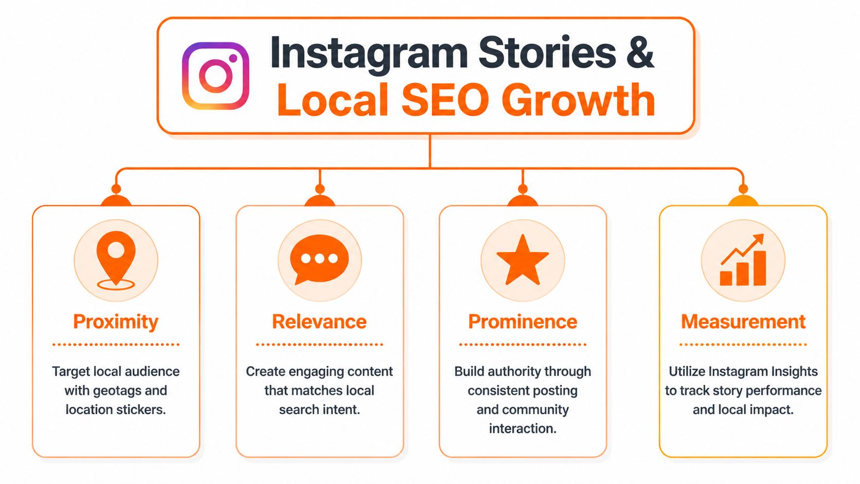
How Stories support proximity relevance and prominence
Google Business Profile visibility still comes back to proximity, relevance, and prominence. Stories do not change proximity, but they can support the other two by reinforcing what you do, where you do it, and why local customers trust you.
For a multi-location business, this matters more than it does for a single office. A generic corporate Story can build awareness, but a location-specific Story can support branded search, improve recall, and give prospects the confidence to choose the nearest office. Background color helps by making the post instantly recognizable across locations while still leaving room for city names, service lines, review snippets, and booking prompts.
A few practical examples:
- A dental group posts a Story for its Naperville office with a consistent background color, a same-day emergency message, and a clear location mention.
- A vet clinic shares a review from its South Austin location using the same visual style patients already see in Highlights and on the local landing page.
- An HVAC company runs weather-driven Stories by service area so the message matches what nearby homeowners are dealing with that week.
The business outcome is simple. People recognize the brand faster, connect the message to the right location, and are more likely to call or book after they search.
A short Google Business Profile checklist
Story performance is stronger when the rest of your local presence is accurate. If someone leaves Instagram and lands on a weak Google Business Profile, the Story did its job and the profile lost the lead.
Check these basics for each location:
- Business name, address, phone, and hours: keep them accurate everywhere
- Primary category and services: match them to the actual location offering
- Photos: use real staff, real spaces, and real service moments
- Reviews: ask steadily so each office keeps fresh proof coming in
- Responses: reply fast enough that prospects see active management
- Booking path: test the call button, form, and appointment flow on mobile
If you manage this across several offices, a clear local SEO reporting setup for multi-location teams makes it much easier to spot which locations are getting profile views, calls, and direction requests after Story activity.
How to measure from Story view to call or booking
Views are only the top of the funnel.
Track Story performance by location and by intent. Use UTM parameters on links so your team can separate a review-focused Story from a promo Story or an office-specific update. Keep the naming clean and consistent.
A workable pattern looks like this:
- utm_source=instagram
- utm_medium=story
- utm_campaign=reviews_chicago
- utm_campaign=walkins_tempe
- utm_campaign=newpatients_charlotte
Then measure what happens after the tap:
- Profile visits: did the Story push people to check the account
- Link clicks: did they move to the booking or location page
- Calls: did phone inquiries rise for that office after the Story ran
- Bookings: did actual appointments or estimate requests increase
- Review activity: did review requests tied to Stories produce new public feedback
- Response speed: did staff reply to Story DMs and review comments fast enough to convert interest
For multi-location brands, compare these numbers by office, not just brand-wide totals. One location may get strong reach but weak booking conversion because the offer is unclear. Another may have lower reach but more calls because the Story names the city, service, and next step clearly.
That is the actual use case. Story backgrounds are not just a design choice. They help standardize local messaging, support reputation signals, and make it easier to measure which locations turn attention into booked business.
Instagram Story Backgrounds FAQ
Can I set a default background color for all my Stories
No. Instagram doesn't give you a universal default background setting for every Story. The practical workaround is to save a few branded background images in your camera roll and reuse them.
What’s the best background color for a service business
Use the one that matches your brand and keeps text easy to read. Blue often works well for trust-focused services like dental, healthcare, HVAC, and legal. Warm colors can work for promos if the offer needs urgency.
Why does my background look different on different phones
Phone screens vary in brightness, contrast, and color rendering. Highly saturated shades can shift the most. That's why dark backgrounds with bright text, or light backgrounds with dark text, usually hold up better across devices.
Should I use a solid fill or a video tint
Use a solid fill for text-first announcements. Use a tint when the video itself matters and you just need better readability over it.
Can I use Story backgrounds to support “near me” searches
Yes, indirectly. Stories won't replace local SEO, but they can reinforce your service areas, local proof, and brand recognition for people who later search terms like “vet near me” or “best dentist in [City].”
What apps are best for custom Story backgrounds
Canva and Adobe Express are practical choices for most local teams because they make it easy to save reusable sizes, colors, and templates. Instagram's own editor is still the fastest for quick posts.
Where can I improve my posting timing
If your Stories are strong but results are inconsistent, review your schedule and cadence. This guide on the best day to post on social media can help you tighten your timing.
If you want help turning reviews, branded content, and local listings into more calls and bookings, Reviews To The Top offers month-to-month support for local and multi-location businesses. They help with review generation, responses, listing accuracy, and the reporting needed to connect visibility to real outcomes.